Development
Eight must know CSS wizard spells


Here are 8 quick CSS magic techniques to help you out as a 2020 front-end wizard.
Chances are you already know some of these, but hopefully you'll learn something new!
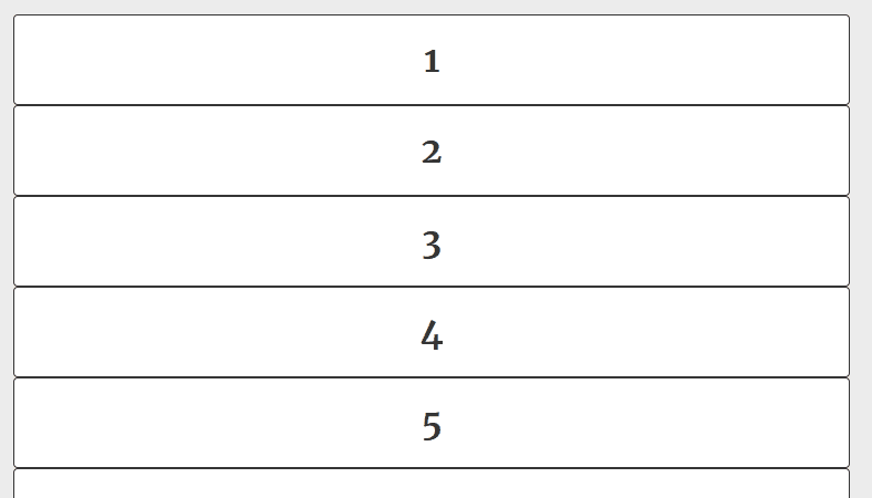
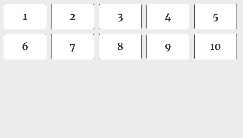
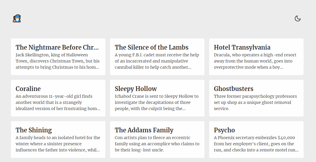
1. Instant fluid grid layout
.grid { display: grid; grid-template-columns: repeat(auto-fill, minmax(12rem, 1fr)); grid-gap: 1rem;}
Just a really easy way to have a responsive grid, without having to think about columns and rows at all. Provide a minimum width to your elements and the CSS grid engine takes care of the rest.
Before with just display block:After with 3 properties applied
2. Truncate strings so they fit on one line
Very handy technique to make sure titles and short texts don't wrap on multiple lines.
.truncate { white-space: nowrap; overflow: hidden; text-overflow: ellipsis;}
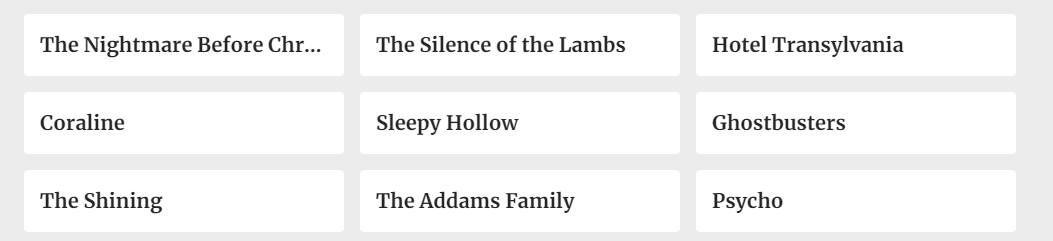
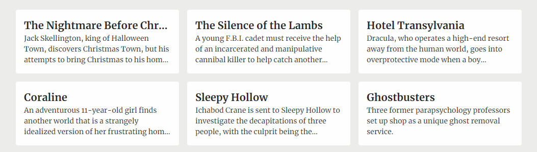
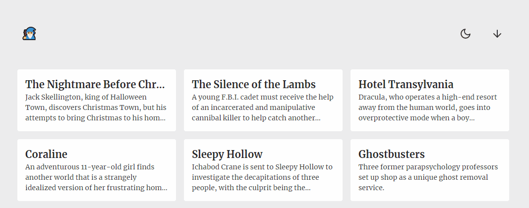
3. Truncate text to a specific number of lines
Similar as above, but for any desired number of lines.
.line-clamp { display: -webkit-box; -webkit-line-clamp: 3; -webkit-box-orient: vertical; overflow: hidden;}
Here's our cards with 3 lines descriptions.
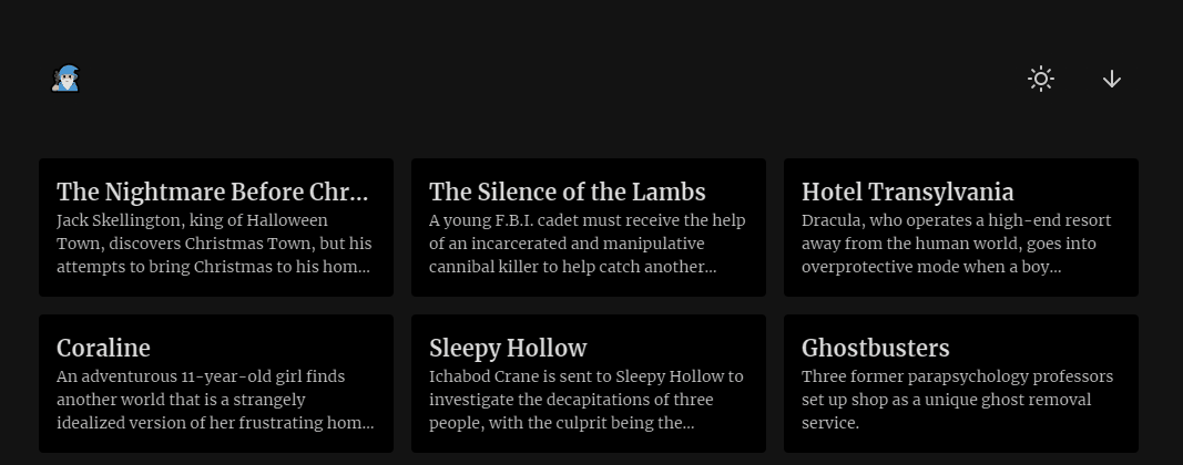
4. Instant dark mode with 1 line of CSS
Just 1 line of CSS and it does the trick for most cases. Especially useful if you have an existing design and you just want to effortlessly add a dark theme to it.
.dark-theme { filter: invert(1) hue-rotate(180deg);}
Now some elements like pictures and gradients might look off, you can leave them untouched by inverting them again. Here's a more realistic implementation:
.dark-theme,.dark-theme img,.dark-theme .ignore-dark-theme { filter: invert(1) hue-rotate(180deg);}
Now let's add some JS for toggling the class.
const toggleTheme = () => { if (document.documentElement.classList.contains('dark-theme')) { document.documentElement.classList.remove('dark-theme'); } else { document.documentElement.classList.add('dark-theme'); }};
Tada!
5. Smooth scroll
Here's another 1-liner to add smooth scrolling to your website.
html { scroll-behavior: smooth;}
Example usage with plain anchor links:
<!-- Add an scroll target --><body> <a id="top" href="#bottom">Scroll to bottom</a> <!-- Site content... --> <a id="bottom" href="#top">Scroll to top</a></body>
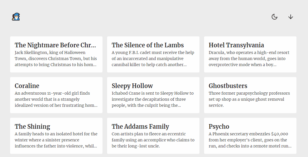
6. Sticky header
header { position: sticky; top: 0;}
Difference with position: fixed; is that position position: sticky; will keep it's place in the document flow, meaning that the content will not shift upwards like it would if you used fixed. Also, position: sticky; is not necessarily fixed to the viewport, it will simply try to remain within the view port based on the top, left, right and bottom values you give it, within the scrolling container.
Here's an example with top: 1rem;:
7. Easy hover and active states
There is nothing magical about this one but if you want quick hover and active states for clickable elements, you can easily achieve good enough results with this, which is what you would manually do anyways:
a:hover,button:hover { filter: brightness(0.9);}a:active,button:active { filter: brightness(0.85);}

8. Pure CSS tooltips
Let's finish off with simple tooltips you can easily add to improve the user experience, with just CSS.
.tooltip { position: relative;}.tooltip:hover::before { opacity: 1;}.tooltip::before { opacity: 0; display: block; content: attr(aria-label); background-color: #353535; color: white; font-family: Arial, Helvetica, sans-serif; font-size: 0.875rem; text-decoration: none; white-space: nowrap; padding: 0.5rem; border-radius: 0.25rem; pointer-events: none; position: absolute; top: 100%; left: 100%;}
You can add directions for the tooltip to appear in as such:
.tooltip.left::before { left: auto; right: 100%;}
Usage:
<span class="tooltip" aria-label="Tooltip content goes here!"> Hover for more info. </span>
Bonus: Codepen demo of everything combined
If you want to discover other tips and tricks, take a look at the software development section of our blog.
Photo credit: Michał Kubalczyk

Did this article start to give you some ideas? We’d love to work with you! Get in touch and let’s discover what we can do together.
Further Reading


